TL;DR:
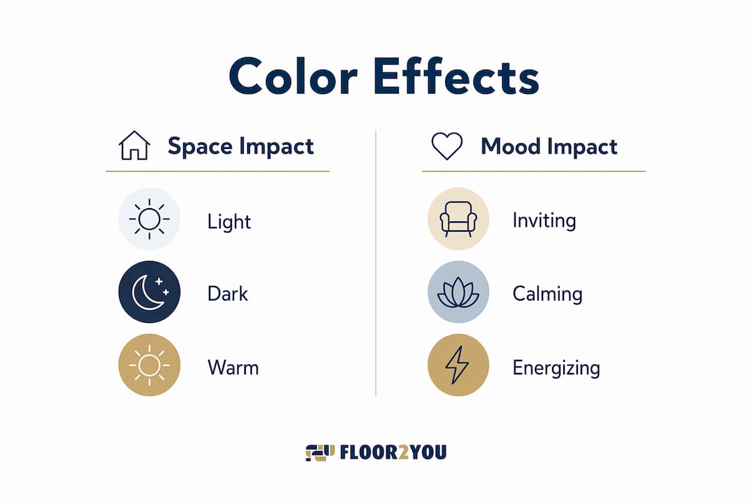
- Color influences how a space feels, affecting mood, perceived size, and social interactions. Proper planning ensures a cohesive palette that enhances both aesthetics and resale value, with early decisions about color guiding material choices and lighting considerations.
Color is defined in interior design as one of the most powerful tools for shaping how a space feels and functions. The role of color schemes in remodeling goes far beyond aesthetics. Color directly influences mood, perceived room size, social behavior, and even cognitive performance. Research confirms that color functions as a tool influencing cognition, social interactions, and sleep, often shaping how occupants feel without them realizing it. Whether you are planning a full renovation or a single room refresh, the palette you choose is one of the most consequential decisions you will make.
How does color affect perception of space and emotional ambiance in remodeling?
Color psychology in home design is the study of how specific hues alter perception, mood, and behavior inside a space. Light colors make rooms feel larger and brighter. Dark colors create a sense of intimacy and enclosure. These are not opinions. They are documented perceptual effects that every designer and homeowner should understand before picking a single paint chip.
Warm colors increase physiological arousal by 18.6%, while cooler colors produce only 7.8% arousal but generate higher positive emotional responses. That gap explains why a red dining room feels exciting and a pale blue bedroom feels restful. Each effect is appropriate in its own context, but misapplied, they work against you.
The table below summarizes how common color types affect perception and mood in residential spaces.
| Color type | Perceived space effect | Emotional effect | Best room application |
|---|---|---|---|
| Light neutrals (white, cream) | Enlarges and brightens | Calm, clean, open | Living rooms, small bathrooms |
| Warm tones (red, orange, yellow) | Can feel smaller, cozier | Energizing, social, stimulating | Kitchens, dining rooms |
| Cool tones (blue, green, gray) | Feels airy or receding | Calming, focused, restful | Bedrooms, home offices |
| Deep, saturated darks | Creates intimacy | Dramatic, cocooning | Accent walls, libraries |
| Muted mid-tones | Neutral perception | Balanced, comfortable | Multi-purpose rooms |
Understanding this table gives you a framework. It does not give you a finished palette. That requires knowing how undertones and saturation interact with your specific space.
Why undertones and saturation matter in choosing color schemes
Undertones are the subtle secondary hues hidden within a paint color. A white wall can read warm (yellow or pink undertone) or cool (blue or green undertone) depending on its base. Saturation refers to how pure or intense a color is. Both factors determine whether a palette feels harmonious or subtly wrong.
Mixing warm and cool undertones incorrectly causes a space to feel off even when individual colors look fine on their own. This is the most common mistake homeowners make when choosing paint. They select colors they love in isolation, then wonder why the finished room feels unsettled.
Saturation level also affects long-term comfort. High-saturation colors are visually stimulating and energizing in short bursts. Living with them daily is a different experience. Low- to mid-saturation shades are better suited for daily living environments because they reduce sensory overload without feeling flat.
Key pitfalls to avoid when selecting a palette:
- Choosing paint colors under store lighting, which is typically cool fluorescent and distorts warm undertones
- Pairing a warm beige floor with a cool gray wall, creating an undertone clash that no amount of decor can fix
- Using high-saturation colors on large wall surfaces in rooms where you spend long periods of time
- Selecting a trendy accent color for permanent tile or cabinetry, which limits future flexibility
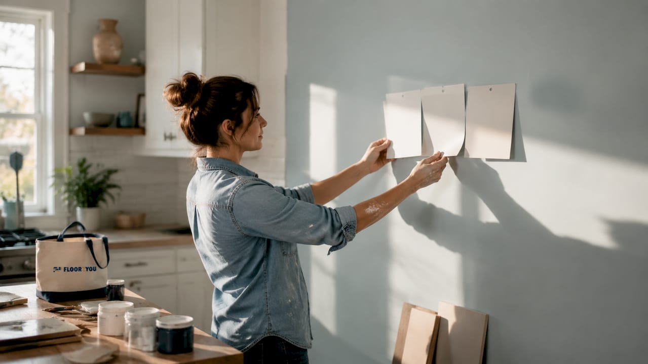
Pro Tip: Always test paint samples as large swatches (at least 12 by 12 inches) on your actual wall and observe them at different times of day. Morning light, afternoon sun, and evening artificial light will each shift how the color reads.
What practical strategies optimize color scheme planning during remodeling?
Color planning should begin early in remodeling to synchronize with materials, lighting, and sightlines for cohesive results. Choosing paint as an afterthought forces you to work around fixed decisions like flooring, cabinetry, and countertops. Starting with color lets every other material selection align with the intended mood.
The most reliable planning framework in color theory for interior design is the 60:30:10 rule. The 60:30:10 rule allocates 60% of a room's color to a dominant hue (typically walls and large furniture), 30% to a secondary hue (upholstery, rugs, curtains), and 10% to an accent (pillows, art, accessories). This ratio prevents visual overload and creates a professional, intentional result.
A practical step-by-step approach to color planning during a remodel:
- Identify your fixed elements first. Flooring, tile, and cabinetry are expensive to change. Pull their undertones and build your palette around them.
- Set the dominant color. Choose a wall color that aligns with the room's function and the emotional effect you want.
- Select a secondary color. This should share undertones with the dominant color. It appears in soft furnishings and mid-sized surfaces.
- Choose one accent color. Keep it bold if you want visual interest. Confine it to items you can swap out easily.
- Test everything together. Place paint swatches, fabric samples, and flooring samples side by side in the actual room before committing.
- Plan sightlines across rooms. In open-concept layouts, colors in adjacent spaces are always visible together. They must work as a system, not just individually.
Pro Tip: For permanent features like tile, countertops, and hardwood floors, always choose neutral undertones. Bold color choices on fixed surfaces limit your ability to update the space affordably later.
Neutral palettes on permanent, costly elements also protect resale value. Buyers respond to spaces they can picture themselves in. A highly personalized color on a kitchen backsplash narrows that audience significantly.
How to tailor color schemes to specific rooms for function and mood
Room function should drive color selection. The best color combinations for rooms are not about personal preference alone. They reflect how the space is used and what emotional state supports that use.
Warm colors stimulate social interactions, making them well suited for kitchens and dining areas. Cool colors like blues and greens promote calmness and focus, making them ideal for bedrooms and bathrooms. These are not decorating suggestions. They are grounded in documented physiological responses to color.
Room-by-room color guidance:
- Living rooms: Warm, mid-saturation tones like terracotta, warm taupe, or soft gold create an inviting social atmosphere. These spaces benefit from energy without overstimulation.
- Bedrooms: Cool blues, soft greens, and muted lavenders lower physiological arousal and support rest. Avoid high-saturation colors on large surfaces.
- Bathrooms: Pale blues, soft whites, and muted greens create a clean, spa-like calm. For smaller bathrooms, light colors also help the space feel larger. You can find detailed guidance on bathroom color selection based on current trends and psychology.
- Home offices: Muted greens and blues improve creativity and focus and reduce sensory overload. Avoid stark white, which can feel clinical and cold under artificial light.
- Kitchens: Warm whites, soft yellows, and earthy neutrals balance brightness with warmth. For more on kitchen color roles in renovation, current guides break down popular palettes and their functional effects.
Lighting is the variable that changes everything. Natural light shifts throughout the day, and artificial light sources vary from warm incandescent to cool LED. A color that looks perfect at noon can feel flat or harsh by evening. The interplay between lighting and color across connected spaces is one of the most overlooked factors in remodeling decisions.
How do color schemes affect home value and buyer appeal?
Color choices on permanent features directly affect resale value. Neutral palettes appeal to the widest demographic, while personalized permanent colors limit buyer interest. A homeowner who tiles their kitchen in a bold cobalt blue may love it. A buyer who does not will mentally add the cost of replacement to their offer.
The principle is straightforward. Permanent and expensive elements, including flooring, cabinetry, countertops, and tile, should stay neutral and timeless. Bold or trend-driven colors belong in decor, which is easy and inexpensive to change. This approach lets you express personality without locking future buyers into your preferences.
| Element type | Recommended color approach | Reason |
|---|---|---|
| Hardwood or tile flooring | Warm or cool neutrals | Broad appeal, pairs with any palette |
| Kitchen cabinetry | White, gray, or natural wood tones | Timeless, widely preferred |
| Bathroom tile | Light neutrals or soft muted tones | Feels clean, maximizes perceived space |
| Wall paint | Flexible, can be bold or neutral | Inexpensive to change, low risk |
| Soft furnishings and decor | Any color, including trends | Easily swapped without renovation cost |
Trends in color palettes shift every few years. Earthy terracottas, warm greiges, and deep forest greens are prominent in 2026. These work well on walls and in decor. Applying them to permanent surfaces is a risk that most real estate professionals advise against. For a deeper look at how color decisions connect to property value, the home value and remodeling relationship is worth understanding before you finalize any palette.
Key takeaways
Color selection is the single most cost-effective remodeling decision because it shapes mood, perceived space, and resale value before a single fixture is installed.
| Point | Details |
|---|---|
| Start color planning early | Coordinate palette with flooring, lighting, and sightlines before materials are ordered. |
| Use the 60:30:10 rule | Assign 60% dominant, 30% secondary, and 10% accent color to prevent visual overload. |
| Match undertones consistently | Mixing warm and cool undertones creates discord even when individual colors look good alone. |
| Keep permanent features neutral | Neutral flooring and cabinetry protect resale value and appeal to the widest buyer pool. |
| Match color to room function | Cool tones support rest and focus; warm tones energize social and cooking spaces. |
Color is not decoration. It is architecture.
The most common mistake I see in remodeling projects is treating color as the last decision. Homeowners spend months selecting tile, cabinetry, and countertops, then pick paint in an afternoon. The result is a space where everything is technically fine but nothing quite connects.
Color should be foundational. It is the element that ties flooring to walls to ceiling to light. When you plan it early, every other material decision becomes easier because you have a clear emotional target. When you plan it last, you are trying to solve a puzzle with the pieces already glued down.
The undertone issue is real and underappreciated. I have seen beautifully selected individual colors create rooms that feel subtly wrong because a warm beige floor was paired with a cool gray wall. Neither color was a bad choice. Together, they fought each other. Consistent undertones are not a design preference. They are a structural requirement for harmony.
The other lesson I keep returning to is this: color as a foundational element must account for how light moves through a space across the day. A palette that works beautifully in a south-facing room will behave differently in a north-facing one. Designing for your specific light conditions, not for a photo you saw online, is what separates a good result from a great one.
— G
Floor2you brings color planning into your remodel from day one
Choosing the right palette is only half the work. Executing it across flooring, walls, and fixtures requires coordination that most homeowners underestimate.

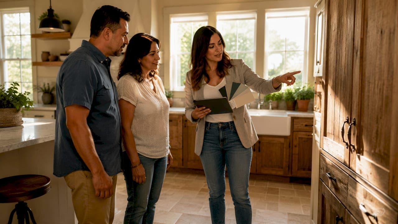
Floor2you works with South Florida homeowners and property managers to integrate color planning into the full remodeling process, from initial material selection through final installation. Whether you are updating a kitchen, refreshing a bathroom, or managing a full home renovation, Floor2you's team coordinates color with every surface and finish. Visit Floor2you's remodeling services to request a consultation and get expert guidance on building a palette that works for your space, your lifestyle, and your resale goals.
FAQ
What is the role of color schemes in remodeling?
Color schemes define the aesthetic and emotional character of a remodeled space. They influence perceived room size, mood, social behavior, and long-term comfort for everyone who lives in the home.
How does color psychology apply to home design?
Color psychology identifies how specific hues trigger physiological and emotional responses. Warm colors increase energy and social interaction; cool colors promote calm and focus, making each suited to different rooms.
What is the 60:30:10 rule in interior color planning?
The 60:30:10 rule assigns 60% of a room's color to a dominant hue, 30% to a secondary hue, and 10% to an accent. This balance creates visual interest without sensory overload.
Which colors increase home resale value?
Neutral palettes on permanent features like flooring, cabinetry, and tile appeal to the broadest range of buyers. Bold or personalized colors are best reserved for decor that can be changed inexpensively.
Why do undertones matter when choosing paint colors?
Undertones are the hidden secondary hues within a paint color. Mixing warm and cool undertones across a room creates a subtle discord that makes the space feel off, even when individual colors seem attractive on their own.